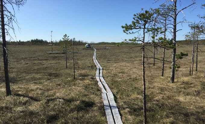
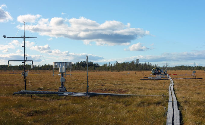
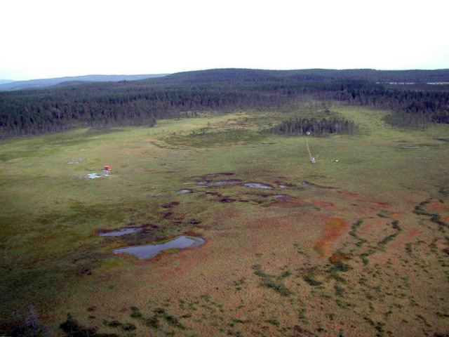
Photo: Eric LarmanouPhoto: Paul SmithPhoto: Paul SmithAerial view Degerö mire
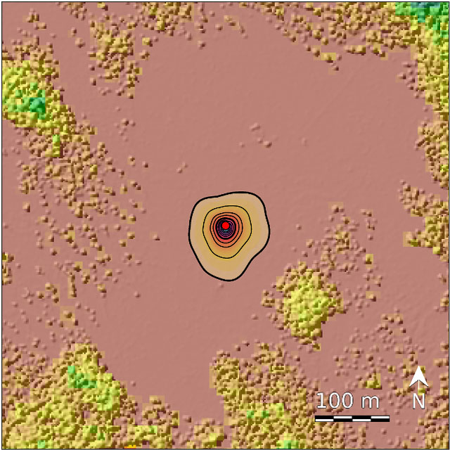
Where does the air come from that is measured at 1.8 m height at the tower? Footprint area for July 2014. Each contour line adds 10% contribution starting at the tower (red dot); the background map is an illustration of the vegetation height; footprint model FFP (Kljun et al. 2015).
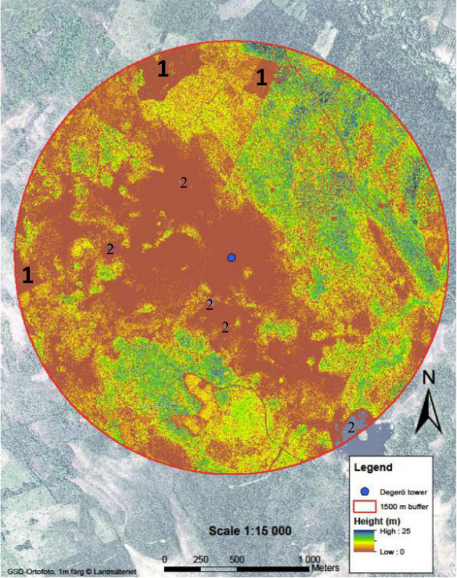
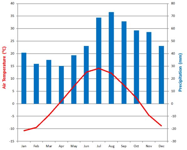
Vegetation map of Degerö: The different colours refers to a canopy height model. Almost all reddish/brownish areas represent mire areas and yellow-green areas represent forests varying in canopy height. Three clear cut areas are marked by #1 and open pools/lakes in the mire are marked by #2. Climate diagram Vindeln. Data from SMHI (1961-1990). The diagram displays monthly averages for temperature and precipitation. Precipitation curve undercutting the temperature curve indicates dry season. Precipitation curve exceeding the temperature curve indicates moist season.
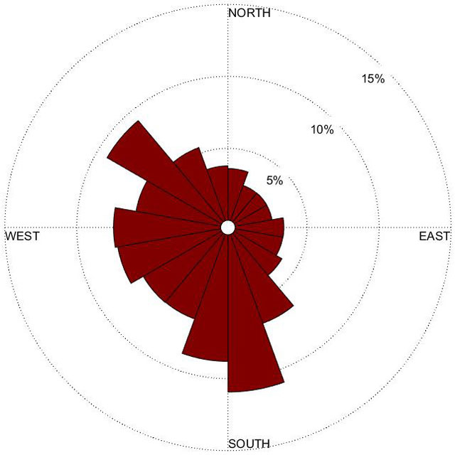
Wind rose Degerö.Data from 2014-01-01 until 2016-11-20 measured with a sonic anemometer .
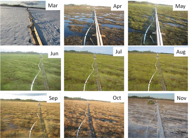
The site Degerö shows a strong seasonality with 5-6 months snow cover.
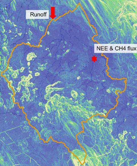
Digital elevation model (DEM) based on Lidar data for Degerö, 2x2m resolution. Blue: mire area, green/yellow: forested mineral soils, red arrows: surface water flow directions.